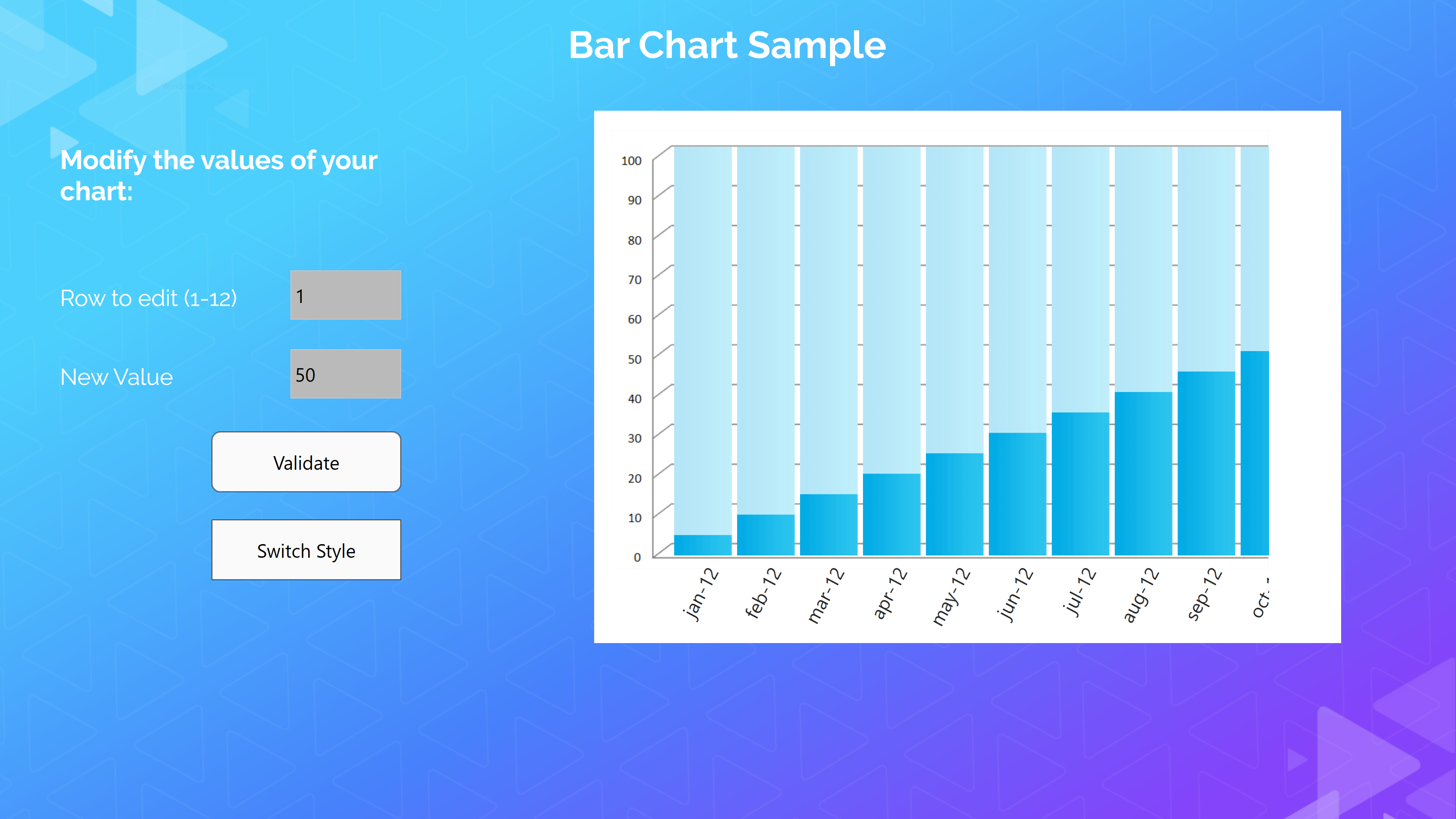
This article describes how to display Excel spreadsheet data as a bar chart. You can download the BarChart Sample experience here.
This project uses the following concepts:
- Excel Interface Asset as a data source.
- Data Template for formatting the look of the data.
- The Linear Gauge is the main component of the Data Template.
- two Text Input assets for user input of data using a virtual keyboard.
- a few Triggers & Actions to update the Excel spreadsheet with values entered by users into the Text Input assets above.
To locate the Excel file, unzip the BarChart Sample and open the folder BarChart-Sample_Files, then Interface Assets, then Chart-Sample_xlsx. Here you will see the file Chart-Sample.xlsx.
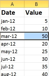
This Excel file contains the following information:
- Date: Used as a label on the X axis.
- Value: A value. In this sample we use a percentage between 0 and 100. If you want to use another scale, you will have to update the Empty value and Full value properties of the Linear Gauge used in the Data Template. See the next section for more about the Data Template.
The Data Template is composed of:
- a Simple Text asset bound to the Date column of the Excel Interface Asset.
- a Linear Gauge asset with its Value property bound to the Value column of the Excel Interface Asset.
- This asset’s Empty gauge image and Full gauge image properties are bound to hidden images, enabling users to change the color theme of the chart. If these properties referenced images directly, users would not be able to change them at runtime.
(Click to enlarge) 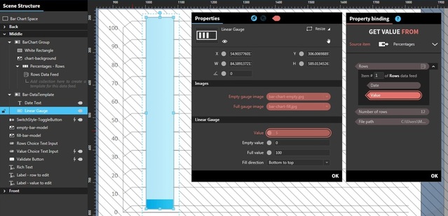
Remember, you can find all of our Instructional videos here. Of particular note for this article is the video introducing our Data Templates here
Comments
0 comments
Article is closed for comments.